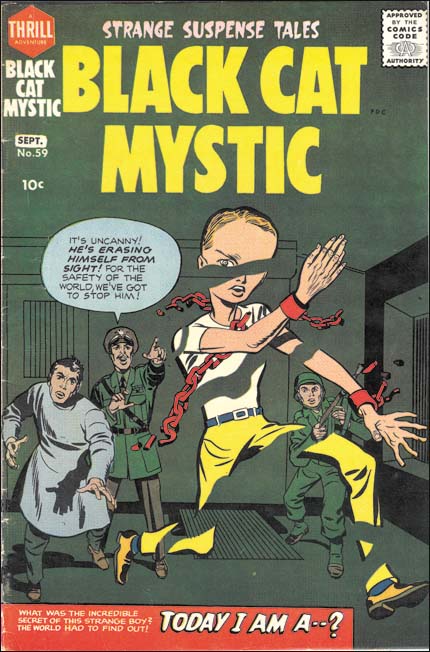
Again, welcome to those who visit this domain of war and heroes and wish to unravel the meaning behind the most famous of graphic novels. Recently, upon touring the Jack Kirby artwork exhibit at the California State University of Northridge, I came across an illustration which seemed to envelope my hypothesis of the World Wars affecting racial qualities of both heroes and villains. The artwork was the cover of a graphic novel titled, "Black Cat Mystic." It was, as expected, illustrated by Jack Kirby, who, himself, had served in the Second World War as a scout who advanced into towns and drew reconnaissance maps of enemy positions, an inherently perilous job. Kirby used his knowledge of the conventions of graphic illustration, symbolic meaning, and World War 2 enemies to provide an image that lures readers in with purely sensory perceptions, but the seemingly proactive composition of these elements may have been what brought the comic such an infamous reputation.

Jack Kirby's illustration of this particular cover involves many different aspects of artistic communication of feeling and emotion. Initially, the first major characteristic the viewer notices is the bright colors of the hero, contrasting with the dull, lifeless, and murky green of the background setting and characters. The hero's bright red chains stand out to highlight the fact that the hero was being held against his will, and is now possibly escaping. Feelings of freedom, or the struggle to obtain it, flood the mind's eye. Using the variety of color, the range of emotion felt when experiencing the image expands, "With these three colors, plus white, I [have] a wide emotional range, and each color [is] distinct from the others” (Bang, 13). The use of space throughout the cover is significant because of the placement of each figure and their orientation on the page. The hero is centered, ensuring that this is the first body we examine. The enemies are positioned smaller and higher on the page, and with the help of the lines used to detail the walls and ceiling, create the illusion of depth. “By arranging the pieces so that the thinner they are, the higher upon their page their bases are placed, a perception of depth occurs" (Bang, 16). The hero is seen as leaping out of danger as the enemies desperately attempt to catch him, showing another layer of artistic depth.
Tying this image into my discussion of Wars, Jack Kirby used specific elements which stood as symbols and direct allusions to World War 2. The enemies, for example, are seen wearing typical Nazi regalia. When compared to the uniform of a Nazi general, the man speaking in the picture has a nearly identical uniform, The figure on the far left resembles a doctor or scientist due to the lab coat, and this fits the allusions to Nazi Germany, as they were known to conduct vile experiments behind the public eye. Even the gun, although it is not seen very well, can be tied to the Gewehr model, a Nazi favorite when it came to rifles used in the war. But how are these meticulous details related to the predominance of the white race in comic books?
Jack Kirby was obviously knowledgeable of the slight details he drew on this cover. However, did he use these specific peculiarities because the World Wars influenced him, possibly through experience in his own life? Or were the details used to further the popularity of the comic by baiting angry, or perhaps, action-seeking viewers of post- World War America? Whatever the true motive may be, only caucasian faces appear on the cover, and there may be a significant consequence behind this fact. Comic book fanatics argue that this particular issue did not receive much popularity and positive feedback because of the delayed release. Others persist that the idea of the Living Eraser didn't seem very bright, adding to the misfortune of the comic's public reception. I, however, maintain that the use of so many post-war allusions was getting dry or morose for the public, and the demand for variety, including that of a racial nature, in graphic novels was on the rise. In addition, the 1950s were a ripe time for the comic book industry, as the first heroes of African American descent began to appear in the works of famous companies such as Entertaining Comics.
Conclusively, this comic possesses many positive features such as the uses of line, shape, color, and space. Additionally, the details which tie the comic to World War 2 are very detailed and do not stray far from the facts of the war. However, upon further examination, the failure of this issue, in particular, may have been due in part to the fact that there is no variety in race on the cover. This seems unlikely at first, but considering that some of the first African- American and Asian- American heroes were to appear in comics a mere 5 years later strikes an important theme.The people of the United States, a country built upon immigration and opportunity, became more open to the idea of racial variation in popular comics following the Second World War. Perhaps people realized that the country they lived in was so special and unique because of the social variety, striking deep into the environment of racial tension among citizens and heroes, alike. But that is a discussion for another day. Farewell.
No comments:
Post a Comment